
title: "Hexo Fluid 瞎折腾" date: 2020-04-01 published: true license: true slug: hexo-fluid tags: ['Hexo', 'Fluid'] cate: tech canonical_url: false
:::note 📄 更新日志
2020.04.10 新增超好看的复选框
2020.04.13 更新动态背景代码
2020.04.28 自定义返回顶部图片和球形标签云
:::
:::warning 🚨 注意 随着主题的更新,文中的代码可能失效或引起错误,请自行修改 :::
好像还没有看到大佬写关于 Fluid 折腾的文章,就开了这个坑
文章放了源码进来,所以挺长的,大部分是改 CSS,JS 很少
首先,按照 Fluid 配置文件中的方法,新建自定义 CSS 和 JS
对于自定义 css,建议新建 custom.styl,接下来的代码基本都是 styl 的,直接放入 css 文件中无法使用
如果你还不知道什么是 stylus,有兴趣的话可以看看这篇文章 『前端干货篇』:你不知道的Stylus
:::tip
新建的是 styl,配置文件中也填 .css
:::
custom_js: /js/custom.js # 指定自定义 js 文件路径,路径是相对 source 目录,如 /js/custom.js
custom_css: /css/custom.css # 指定自定义 css 文件路径,路径是相对 source 目录,如 /css/custom.css
custom_html: ''  # 自定义底部 HTML 内容(位于 footer 上方),也可用于外部引入 js css 这些操作,注意不要和 post.custom 配置冲突
效果见 演示站点
自定义 CSS 中加入如下代码
.slideshow
  position fixed
  width 100vw
  height 100vh

  .slideshow-image
    position: fixed
    background-size cover
    width 100%
    height 100%
    background repeat 50% 50%
    animation-name kenburns
    animation-timing-function linear
    animation-iteration-count infinite
    animation-duration 24s
    opacity 1
    transform scale(1.2)
    filter brightness(70%) //背景遮罩,100% 正常,0% 完全黑色

    &:nth-child(1){-webkit-animation-name: kenburns-1; animation-name: kenburns-1; z-index: -2;}
    &:nth-child(2){-webkit-animation-name: kenburns-2; animation-name: kenburns-2; z-index: -3;}
    &:nth-child(3){-webkit-animation-name: kenburns-3; animation-name: kenburns-3; z-index: -4;}
    &:nth-child(4){-webkit-animation-name: kenburns-4; animation-name: kenburns-4; z-index: -5;}

@keyframes kenburns-1{0%{opacity: 1; -webkit-transform: scale(1.2); transform: scale(1.2);} 1.5625%{opacity: 1;} 23.4375%{opacity: 1;} 26.5625%{opacity: 0; -webkit-transform: scale(1); transform: scale(1);} 100%{opacity: 0; -webkit-transform: scale(1.2); transform: scale(1.2);} 98.4375%{opacity: 0; -webkit-transform: scale(1.21176); transform: scale(1.21176);} 100%{opacity: 1;}}
@keyframes kenburns-2{23.4375%{opacity: 1; -webkit-transform: scale(1.2); transform: scale(1.2);} 26.5625%{opacity: 1;} 48.4375%{opacity: 1;} 51.5625%{opacity: 0; -webkit-transform: scale(1); transform: scale(1);} 100%{opacity: 0; -webkit-transform: scale(1.2); transform: scale(1.2);}}
@keyframes kenburns-3{48.4375%{opacity: 1; -webkit-transform: scale(1.2); transform: scale(1.2);} 51.5625%{opacity: 1;} 73.4375%{opacity: 1;} 76.5625%{opacity: 0; -webkit-transform: scale(1); transform: scale(1);} 100%{opacity: 0; -webkit-transform: scale(1.2); transform: scale(1.2);}}
@keyframes kenburns-4{73.4375%{opacity: 1; -webkit-transform: scale(1.2); transform: scale(1.2);} 76.5625%{opacity: 1;} 98.4375%{opacity: 1;} 100%{opacity: 0; -webkit-transform: scale(1); transform: scale(1);}}
接着在 themes\fluid\layout\layout.ejs 中 <body> 后加入如下代码
background-image: url 中填入图片链接
<div class="slideshow">
    <div class="slideshow-image" style="background-image: url('1')"></div>
    <div class="slideshow-image" style="background-image: url('2')"></div>
    <div class="slideshow-image" style="background-image: url('3')"></div>
    <div class="slideshow-image" style="background-image: url('4')"></div>
</div>
然后取消原本头图的获取 用最简单的方法,直接删去获取头图的代码,保留标签
  <header style="height: <%- banner_img_height %>vh;">
    <%- partial('_partial/nav') %>
-    <div class="view intro-2" id="background" <%- theme.banner_parallax && 'parallax=true' %>
-      style="background: url('<%- url_for(banner_img) %>') no-repeat center center;
-        background-size: cover;">
+    <div class="view intro-2" id="background">
      <div class="full-bg-img">
        <div class="mask flex-center">
将主题配置中所有头图的黑色蒙版设为 0
banner_mask_alpha: 0 # 头图黑色蒙版的透明度,available: 0 - 1.0, 0 是完全透明(无蒙版),1 是完全不透明
如果出现背景跟随滚动,请在配置文件中关闭头图滚动视差
banner_parallax: false # 头图滚动视差
因为是依赖 z-index 实现的切换,建议图片大小递增排序,避免第一张图还没加载出来,第二张图先出现的情况
::-webkit-scrollbar-button
  display none

::-webkit-scrollbar
  width 10px
  height 10px
  background-color: #2f415452

::-webkit-scrollbar-thumb
  border-radius 5px
  background-color #2f4154
  background-image -webkit-linear-gradient(45deg,rgba(255,255,255,.2) 25%,transparent 25%,transparent 50%,rgba(255,255,255,.2) 50%,rgba(255,255,255,.2) 75%,transparent 75%,transparent)

  &:hover
    background-color #2f4154b8;
:::tip 会同时对所有滚动条生效 :::
增加动画
#scroll-top-button
  border-radius 25px
  -webkit-transition all .6s
  -moz-transition all .6s
  -o-transition all .6s
  transition all .6s

  &:hover
    transform scale(1.2)
    border-radius 20%
/* 想在手机端也显示,去除最外层的 @media,并更改缩进 */
@media (min-width:768px)
  .post-content
    h1::before
      content: "🌈";
      visibility: visible;
      display: inline;
    h2::before
      content: "🚀";
      visibility: visible;
      display: inline;
    h3::before
      content: "🔍";
      visibility: visible;
      display: inline;
鼠标触碰放大
.index-img
  transition: .4s;

.index-card:hover .index-img
  transform: scale(1.1);
  box-shadow: 0 5px 11px 0 rgba(0,0,0,0.38), 0 4px 15px 0 rgba(0,0,0,0.35);
因为之前的动态背景添加了遮罩导致底部链接等看不起
.tocbot-list a
#toc, footer, footer a
  color #ffffff

footer a:hover
.tocbot-active-link
  color #1abc9c !important
文字触碰动画(源网,找不到原站链接了)
/* 注意避免类名相同造成样式冲突 */
.link {
  outline: none;
  text-decoration: none;
  position: relative;
  font-size: 2em;
  color: #9e9ba4;
  display: inline-block;
}
.link--kukuri {
  text-transform: uppercase;
  font-weight: 700;
  overflow: hidden;
  color: #2f4144;
}

.link--kukuri:hover {
  color: #2f4144;
}

.link--kukuri::after {
  content: '';
  position: absolute;
  height: 10px;
  width: 100%;
  top: 42%;
  margin: auto;
  right: 0;
  background: #F9F9F9;
  -webkit-transform: translate3d(-100%,0,0);
  transform: translate3d(-100%,0,0);
  -webkit-transition: -webkit-transform 0.4s;
  transition: transform 0.4s;
  -webkit-transition-timing-function: cubic-bezier(0.7,0,0.3,1);
  transition-timing-function: cubic-bezier(0.7,0,0.3,1);
}

.link--kukuri:hover::after {
  -webkit-transform: translate3d(100%,0,0);
  transform: translate3d(100%,0,0);
}

.link--kukuri::before {
  border:0px solid;
  content: attr(data-letters);
  position: absolute;
  z-index: 2;
  overflow: hidden;
  color: #ff779a;
  white-space: nowrap;
  width: 0%;
  -webkit-transition: width 0.4s 0.3s;
  transition: width 0.4s 0.3s;
}

.link--kukuri:hover::before {
  width: 100%;
}
然后在你想显示的地方插入如下 HTML
:::tip
data-letters 中需要和内容保持一致
不用 a 标签也可以,保证类名正确
:::
<a class="link link--kukuri" href="test.test" data-letters="test">test</a>
在 themes\hexo-theme-fluid-master\layout\ 中新建 messageboard.ejs 文件
先写上头图之类的设定
<%
page.layout = "messageboard"
page.title = theme.messageboard.title || __('messageboard.title')
page.subtitle = theme.messageboard.subtitle || __('messageboard.subtitle')
page.banner_img = theme.messageboard.banner_img
page.banner_img_height = theme.messageboard.banner_img_height
%>
然后在配置文件中加入相应内容,当然,你也可以直接在上面的代码中指定
#---------------------------
# 留言板页
# Messageboard Page
#---------------------------
messageboard:
  banner_img:         # 头图
  banner_img_height:  # available: 0 - 100
  subtitle:           # 打字机内容
语言文件中也是一样的,这里就不写了
刚刚创建的 ejs 文件中
<!-- Comments -->
<div class="container comments mx-auto" id="comments">
    <% if(theme.post.comments.enable) { %>
    <br><br>
    <% var type = '_partial/comments/' + theme.post.comments.type %>
    <%- partial(type) %>
    <% } %>
</div>
自定义内容写在评论代码之前就好了,支持 HTML
然后两种方法开启,二选一即可
在根目录的 source 文件夹中创建 messageboard.md
并在 front-matter 中加上 layout: messageboard
和 about 界面的方法一样
在 themes\fluid\scripts\pages.js 文件中加入如下代码
// generate messageboard page
hexo.extend.generator.register('_messageboard', function (locals) {
  return {
    path: 'messageboard/index.html',
    data: locals.theme,
    layout: 'messageboard',
  };
});
本身的 aplayer 个人觉得并不是很好看,而且是全局的 换了给好看点的播放器,在指定页面加载 需要加载的页面加入
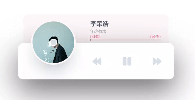
自定义 js 里加入
(function() {
    var dr = $("#dowebok");
    if(!dr.length > 0) return;
    dr.append("<div id=\"player\"><div id=\"player-track\"><div id=\"album-name\"></div><div id=\"track-name\"></div><div id=\"track-time\"><div id=\"current-time\"></div><div id=\"track-length\"></div></div><div id=\"s-area\"><div id=\"ins-time\"></div><div id=\"s-hover\"></div><div id=\"seek-bar\"></div></div></div><div id=\"player-content\"><div id=\"album-art\"><img src=\"images/1.jpg\" class=\"active\" id=\"album-pic\"><div id=\"buffer-box\">加载中...</div></div><div id=\"player-controls\"><div class=\"control\"><div class=\"player-button\" id=\"play-previous\"><i class=\"fas fa-backward\"></i></div></div><div class=\"control\"><div class=\"player-button\" id=\"play-pause-button\"><i class=\"fas fa-play\"></i></div></div><div class=\"control\"><div class=\"player-button\" id=\"play-next\"><i class=\"fas fa-forward\"></i></div></div></div></div></div>");
    var playerTrack = $("#player-track"),
        albumName = $('#album-name'),
        trackName = $('#track-name'),
        albumArt = $('#album-art'),
        sArea = $('#s-area'),
        seekBar = $('#seek-bar'),
        trackTime = $('#track-time'),
        insTime = $('#ins-time'),
        sHover = $('#s-hover'),
        playPauseButton = $("#play-pause-button"),
        i = playPauseButton.find('i'),
        tProgress = $('#current-time'),
        tTime = $('#track-length'),
        seekT, seekLoc, seekBarPos, cM, ctMinutes, ctSeconds, curMinutes, curSeconds, durMinutes, durSeconds, playProgress, bTime, nTime = 0,
        buffInterval = null,
        tFlag = false,
        playPreviousTrackButton = $('#play-previous'),
        playNextTrackButton = $('#play-next');
    function playPause() {
        setTimeout(function () {
            if (audio.paused) {
                playerTrack.addClass('active');
                albumArt.addClass('active');
                checkBuffering();
                i.attr('class', 'fas fa-pause');
                audio.play();
            } else {
                playerTrack.removeClass('active');
                albumArt.removeClass('active');
                clearInterval(buffInterval);
                albumArt.removeClass('buffering');
                i.attr('class', 'fas fa-play');
                audio.pause();
            }
        }, 300);
    }
    function showHover(event) {
        seekBarPos = sArea.offset();
        seekT = event.clientX - seekBarPos.left;
        seekLoc = audio.duration * (seekT / sArea.outerWidth());
        sHover.width(seekT);
        cM = seekLoc / 60;
        ctMinutes = Math.floor(cM);
        ctSeconds = Math.floor(seekLoc - ctMinutes * 60);
        if ((ctMinutes < 0) || (ctSeconds < 0)) return;
        if (ctMinutes < 10) ctMinutes = '0' + ctMinutes;
        if (ctSeconds < 10) ctSeconds = '0' + ctSeconds;
        if (isNaN(ctMinutes) || isNaN(ctSeconds)) insTime.text('--:--');
        else insTime.text(ctMinutes + ':' + ctSeconds);
        insTime.css({
            'left': seekT,
            'margin-left': '-21px'
        }).fadeIn(0);
    }
    function hideHover() {
        sHover.width(0);
        insTime.text('00:00').css({
            'left': '0px',
            'margin-left': '0px'
        }).fadeOut(0);
    }
    function playFromClickedPos() {
        audio.currentTime = seekLoc;
        seekBar.width(seekT);
        hideHover();
    }
    function updateCurrTime() {
        nTime = new Date();
        nTime = nTime.getTime();
        if (!tFlag) {
            tFlag = true;
            trackTime.addClass('active');
        }
        curMinutes = Math.floor(audio.currentTime / 60);
        curSeconds = Math.floor(audio.currentTime - curMinutes * 60);
        durMinutes = Math.floor(audio.duration / 60);
        durSeconds = Math.floor(audio.duration - durMinutes * 60);
        playProgress = (audio.currentTime / audio.duration) * 100;
        if (curMinutes < 10) curMinutes = '0' + curMinutes;
        if (curSeconds < 10) curSeconds = '0' + curSeconds;
        if (durMinutes < 10) durMinutes = '0' + durMinutes;
        if (durSeconds < 10) durSeconds = '0' + durSeconds;
        if (isNaN(curMinutes) || isNaN(curSeconds)) tProgress.text('00:00');
        else tProgress.text(curMinutes + ':' + curSeconds);
        if (isNaN(durMinutes) || isNaN(durSeconds)) tTime.text('00:00');
        else tTime.text(durMinutes + ':' + durSeconds);
        if (isNaN(curMinutes) || isNaN(curSeconds) || isNaN(durMinutes) || isNaN(durSeconds)) trackTime.removeClass('active');
        else trackTime.addClass('active');
        seekBar.width(playProgress + '%');
        if (playProgress == 100) {
            i.attr('class', 'fa fa-play');
            seekBar.width(0);
            tProgress.text('00:00');
            albumArt.removeClass('buffering').removeClass('active');
            clearInterval(buffInterval);
        }
    }
    function checkBuffering() {
        clearInterval(buffInterval);
        buffInterval = setInterval(function () {
            if ((nTime == 0) || (bTime - nTime) > 1000) albumArt.addClass('buffering');
            else albumArt.removeClass('buffering');
            bTime = new Date();
            bTime = bTime.getTime();
        }, 100);
    }
    function selectTrack2(flag) {
        //歌单api调用 https://api.uomg.com/doc-rand.music.html
        $.getJSON('https://api.uomg.com/api/rand.music?', {
            sort: "热歌榜", //选择输出分类[热歌榜|新歌榜|飙升榜|抖音榜|电音榜],为空输出热歌榜
            // mid: 12345,    歌单 id
            // sort mid 二选一
            format: 'json'
        }, function(json, textStatus) {
            if (json.code == 1) {
                if (flag == 0) i.attr('class', 'fa fa-play');
                else {
                    albumArt.removeClass('buffering');
                    i.attr('class', 'fa fa-pause');
                }
                seekBar.width(0);
                trackTime.removeClass('active');
                tProgress.text('00:00');
                tTime.text('00:00');
                currAlbum = json.data.artistsname;
                currTrackName = json.data.name;
                currArtwork = json.data.picurl;
                audio.src = json.data.url;
                nTime = 0;
                bTime = new Date();
                bTime = bTime.getTime();
                if (flag != 0) {
                    audio.play();
                    playerTrack.addClass('active');
                    albumArt.addClass('active');
                    clearInterval(buffInterval);
                    checkBuffering();
                }
                albumName.text(currAlbum);
                trackName.text(currTrackName);
                albumArt.find('img.active').removeClass('active');
                $('#album-pic').addClass('active');
                $('#album-pic').attr('src',currArtwork);
            }
        });
    }
    function initPlayer() {
        audio = new Audio();
        selectTrack2(1); //非0自动播放
        audio.loop = false;
        playPauseButton.on('click', playPause);
        sArea.mousemove(function (event) {
            showHover(event);
        });
        sArea.mouseout(hideHover);
        sArea.on('click', playFromClickedPos);
        $(audio).on('timeupdate', updateCurrTime);
        playPreviousTrackButton.on('click', function () {
            selectTrack2(-1);
        });
        playNextTrackButton.on('click', function () {
            selectTrack2(1);
        });
    }
    initPlayer();
})();
自定义 CSS 中加入
#dowebok
  right 0
  left 0
  width 430px
  height 100px
  margin 100px auto 100px

#player
  position relative
  height 100%
  z-index 3

#player-track
  position absolute
  top 0
  right 15px
  left 15px
  padding 13px 22px 10px 184px
  background-color #fff7f7
  border-radius 15px 15px 0 0
  transition 0.3s ease top
  z-index 1

  &.active
    top -80px

#album-name
  color #54576f
  font-size 17px
  font-weight bold

#track-name
  color #acaebd
  font-size 11px
  white-space: nowrap;
  width: 100%;
  overflow: hidden;
  text-overflow:ellipsis;

#track-time
  height 12px
  margin-bottom 3px

  &.active
    #current-time, #track-length
      color #f86d92;
      background-color transparent

#current-time
  float left

#track-length
  float right

#current-time,
#track-length
  color transparent
  font-size 11px
  background-color #ffe8ee
  border-radius 10px
  transition 0.3s ease all


#s-area,
#seek-bar
  position relative
  height 4px
  border-radius 4px

#s-area
  background-color #ffe8ee
  cursor pointer

#ins-time
  position absolute
  top -29px
  color #fff
  font-size 12px
  white-space pre
  padding 5px 6px
  border-radius 4px
  display none;
  background-color #3b3d50

#s-hover
  position absolute
  top 0
  bottom 0
  left 0
  opacity 0.2
  z-index 2
  background-color #3b3d50


#seek-bar
  content ''
  position absolute
  top 0
  bottom 0
  left 0
  width 0
  background-color #fd6d94
  transition 0.2s ease width
  z-index 1

#player-content
  position relative
  height 100%
  background-color #fff
  box-shadow 0 30px 80px #656565
  border-radius 15px
  z-index 2

#album-art
  position absolute
  top -40px
  width 115px
  height 115px
  margin-left 40px
  -webkit-transform rotateZ(0)
  transform rotateZ(0)
  transition 0.3s ease all
  box-shadow 0 0 0 10px #fff
  border-radius 50%
  overflow hidden

  .buffering
    #buffer-box
      opacity 1

    img
      opacity 0.25

      .active
        opacity 0.8
        filter blur(2px)
        -webkit-filter blur(2px)

  img
    display block;
    position absolute;
    top 0;
    left 0;
    width 100%;
    height 100%;
    opacity 0;
    z-index -1;
    transition 0.1s linear all

    &.active
      opacity 1;
      z-index 1;

  &.active
    top -60px
    box-shadow 0 0 0 4px #fff7f7, 0 30px 50px -15px #afb7c1

    img.active
      z-index 1;
      -webkit-animation rotateAlbumArt 3s linear 0s infinite forwards;
      animation rotateAlbumArt 3s linear 0s infinite forwards;

  &::before
    content ''
    position absolute
    top 50%
    right 0
    left 0
    width 20px
    height 20px
    margin -10px auto 0 auto
    background-color #d6dee7
    border-radius 50%
    box-shadow inset 0 0 0 2px #fff
    z-index 2

@-webkit-keyframes rotateAlbumArt
  0%
    -webkit-transform: rotateZ(0)
    transform: rotateZ(0)
  100%
    -webkit-transform: rotateZ(360deg)
    transform: rotateZ(360deg)
@keyframes rotateAlbumArt
  0%
    -webkit-transform: rotateZ(0)
    transform: rotateZ(0)
  100%
    -webkit-transform: rotateZ(360deg)
    transform: rotateZ(360deg)

#buffer-box
  position absolute
  top 50%
  right 0
  left 0
  height 13px
  color #1f1f1f
  font-size 13px
  font-family Helvetica
  text-align center
  font-weight bold
  line-height 1
  padding 6px
  margin -12px auto 0 auto
  background-color rgba(255, 255, 255, 0.19)
  opacity 0
  z-index 2
  transition 0.1s linear all

#player-controls
  width 250px
  height 100%
  margin 0 5px 0 141px
  float right
  overflow hidden

.control
  width 33.333%
  float left
  padding 12px 0

.player-button
  padding 25px
  background-color #fff
  border-radius 6px
  cursor pointer
  transition 0.2s ease all

  i
    display block
    color #d6dee7
    font-size 26px
    text-align center
    line-height 1
    transition 0.2s ease all

  &:hover
    background-color #d6d6de

    i
      color #fff

@media (max-width:768px)
  #dowebok
    width 95%
    height 20vw

  #player-controls
    width 175px

  .player-button
    padding: 20px

    i
      font-size: 20px

    &:hover
      background-color #0000

      i
        color #d6dee7

  #album-art
    width 30%
    height 0
    padding-bottom: 30%

  #album-name
    font-size 15px

  #track-name
    font-size 10px
上方的 css 可在 JS 中引进去,或者在需要的界面加进去 不建议加到全局,毕竟不是所有界面都需要(其实影响也不是很大)
需要加载的页面(md 或者 ejs)中加入
<div id="dowebok"></div>
可能会出现遮挡问题,自己通过 <br> 调整就好了
js 和 css,源自链接
稍作修改,手机端适配我可能没怎么写好 (就那么几行能适配完美才怪)
暗黑模式也没适配这个
音乐来源见 js 代码块的 114、115 行,可选自己的网易歌单或者热歌榜等排行榜
直接把源码部署到一个地方拿来代替用也非常不错,毕竟很好看,再用 Edge 安装在电脑上,嘻嘻嘻
已 PR 至主题,可前往主题更新并通过 Tag 标签使用 但主题只内置了方形选框,下方新增
<div><input type="radio" disabled="" checked=""><p>圆形选框</p></div> <div><input type="checkbox" disabled="" checked=""><p>方形选框</p></div> <div><input type="checkbox" class="red" disabled="" checked=""><p>可选颜色</p></div>下方只介绍 HTML 用法 自定义 CSS 中添加以下代码
input
  -webkit-appearance: none;
  -moz-appearance: none;
  -ms-appearance: none;
  -o-appearance: none;
  appearance: none;
  position: relative;
  right: 0;
  bottom: 0;
  left: 0;
  height: 20px;
  width: 20px;
  transition:all .15s ease-out 0s;
  color: #fff;
  cursor: pointer;
  display: inline-block;
  margin: .4rem .2rem .4rem !important;
  outline: none;
  border-radius: 10%;


/* Checkbox */
input[type=checkbox]
  vertical-align: -0.65rem;

  &:before, &:after
    position: absolute;
    content: "";
    background: #fff;
    transition: all .2s ease-in-out;

  &:before
    left: 2px;
    top: 6px;
    width: 0;
    height: 2px;
    transform: rotate(45deg);
    -webkit-transform: rotate(45deg);
    -moz-transform: rotate(45deg);
    -ms-transform: rotate(45deg);
    -o-transform: rotate(45deg);

  &:after
    right: 9px;
    bottom: 3px;
    width: 2px;
    height: 0;
    transform: rotate(40deg);
    -webkit-transform: rotate(40deg);
    -moz-transform: rotate(40deg);
    -ms-transform: rotate(40deg);
    -o-transform: rotate(40deg);
    transition-delay: .2s;

  &:checked
    &:before
      left: 1px;
      top: 10px;
      width: 6px;
      height: 2px;

    &:after
      right: 5px;
      bottom: 1px;
      width: 2px;
      height: 14px;

/* radio */
input[type=radio]
  vertical-align: -0.7rem;
  border-radius: 50%;

  &:before
    content: "";
    display: block;
    width: 10px;
    height: 10px;
    border-radius: 50%;
    margin: .2rem;
    transform: scale(0);
    transition: all ease-out 250ms;

  &:checked:before
    transform: scale(1);

/* Colors */
input[type=checkbox]
  border: 2px solid #4caf50;

  &:checked, &:indeterminate
    background: #4caf50;

input[type=radio]
  border: 2px solid #4caf50;

  &:checked:before
    background: #4caf50;

input[type=checkbox].blue
  border: 2px solid #2196f3;

  &:checked, &:indeterminate
    background: #2196f3;

input[type=radio].blue
  border: 2px solid #2196f3;

  &:checked:before
    background: #2196f3;

input[type=checkbox].red
  border: 2px solid #f44336;

  &:checked, &:indeterminate
    background: #f44336;

input[type=radio].red
  border: 2px solid #f44336;

  &:checked:before
    background: #f44336;

input[type=checkbox].orange
  border: 2px solid #ffc107;

  &:checked, &:indeterminate
    background: #ffc107;

input[type=radio].orange
  border: 2px solid #ffc107;

  &:checked:before
    background: #ffc107;
用法
<input type="checkbox">
<input type="radio">
默认绿色,设置颜色,只需要加上 class 就行。
目前 class 有 blue red orange,可自行更改 CSS
默认是方形没有打勾,圆形没有选中 加上 chencked 就会默认选中 如下方代码
<input type="radio" chencked>
hexo-tag-cloud 插件是 MikeCoder 写的一个 Hexo 博客的标签云插件
npm install hexo-tag-cloud@^2.1.* --save
在 fluid\layout\tags.ejs 中加入如下代码
<% if (site.tags.length) { %>
  <div class="text-center">
    <script type="text/javascript" charset="utf-8" src="<%- url_for('/js/tagcloud.js') %>"></script>
    <script type="text/javascript" charset="utf-8" src="<%- url_for('/js/tagcanvas.js') %>"></script>
    <div class="widget-wrap">
      <div id="myCanvasContainer" class="widget tagcloud">
        <canvas width="250" height="250" id="resCanvas" style="width=100%">
          <%- tagcloud() %>
        </canvas>
      </div>
    </div>
  </div>
<% } %>
根目录配置文件添加如下的配置
# hexo-tag-cloud
tag_cloud:
    textFont: Trebuchet MS, Helvetica
    textColor: '#333'
    textHeight: 25
    outlineColor: '#E2E1D1'
    maxSpeed: 0.5
textColor: 字体颜色
textHeight: 字体高度
maxSpeed: 文字滚动速度
源网
.markdown-body
  pre
    padding-bottom 5px

    code
      padding 1rem 0 .5rem 0

      &::before
        content ' '
        position absolute
        background #fc625d
        border-radius 50%
        box-shadow 20px 0 #fdbc40, 40px 0 #35cd4b
        margin-top -20px
        left 12px
        height 12px
        width 12px
应该没啥可折腾的了,还有的话也不新开文章了,就这里持续更新吧,会置顶并将最近一次更新写在摘要中
暗黑模式下篇文章再写吧 (水文章数量)
作者已经把主题做的非常完美了,有什么问题都会立马修复,功能也出的很快,超 nice
博客刚搭建的时候用了一个 material 主题,觉得过于平淡,换到了一个 gal 主题,功能很多 慢慢的又看厌了,很多人推荐 Next,就又换到了 Next,的确很好用 就光针对 Next 的教程数量而言,应该能算是大部分用 Hexo 的人都用过的 经常逛博客也发现很多都是用的这个主题,用了几个月,改了很多东西,但也慢慢看厌了
就开始再次踏上寻找主题的路,经常看到一个好看的主题,但又想到自己在 Next 上大量的自定义内容,一直不忍心丢下 看到 Fluid 之后超喜欢,先用 Fluid 搭建了副站,放在 Gitee 上,慢慢完善 完善到一定程度,有人和我说副站更好看,我看了看好像真是这么回事... 才下定决心开始换主题,前前后后花了一个多星期全部完成
Fluid 应该是会一直用下去了 不过仍有继续折腾的打算 可能会再用 Typecho 搭建一个玩玩...